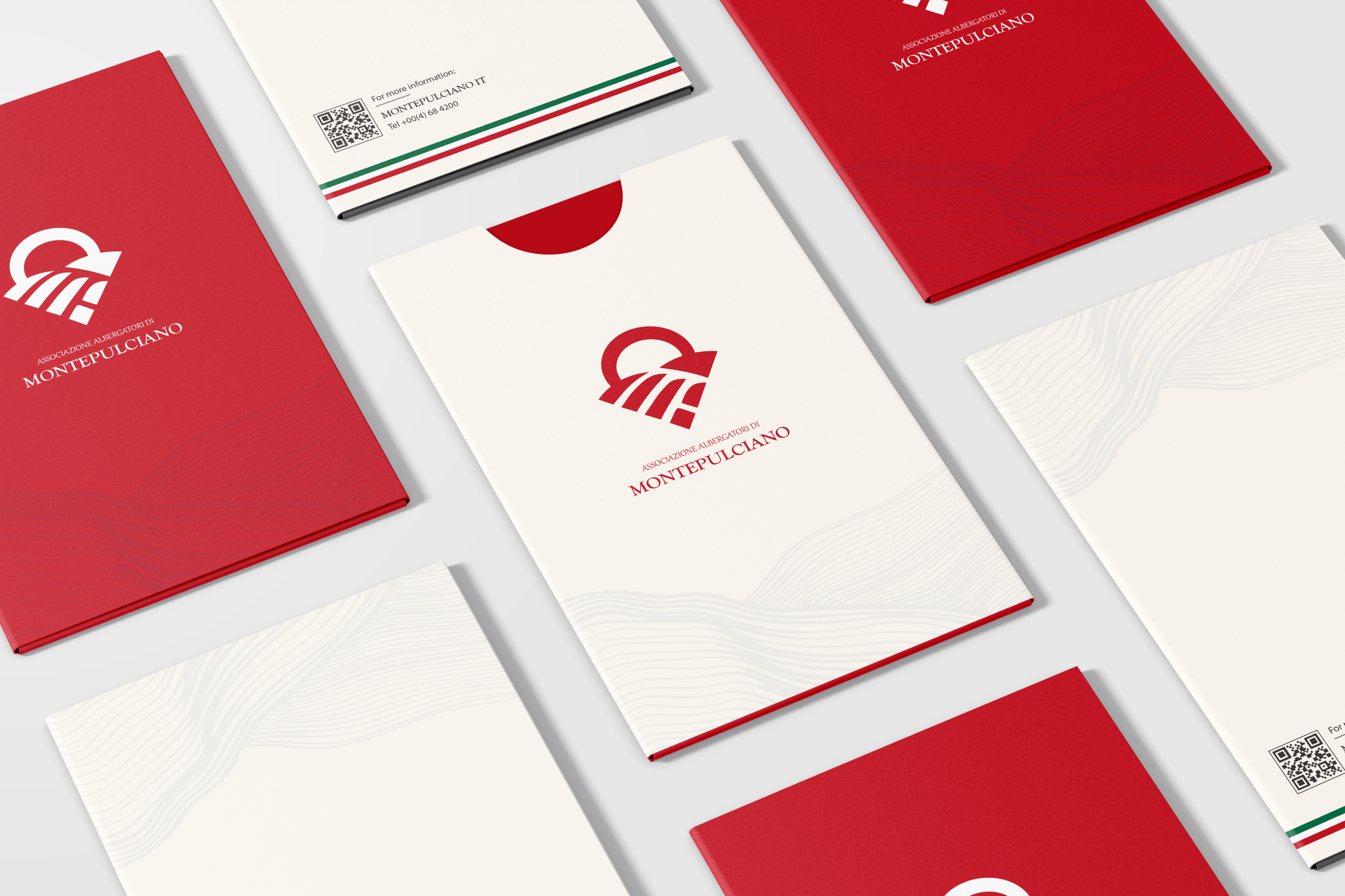
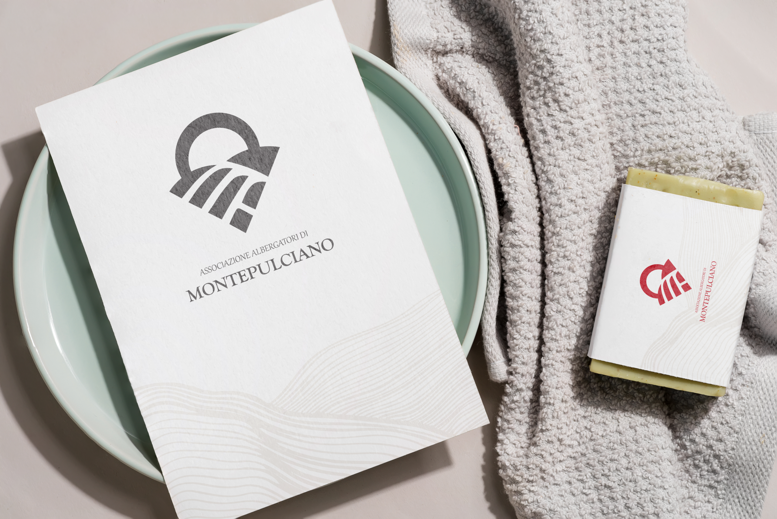
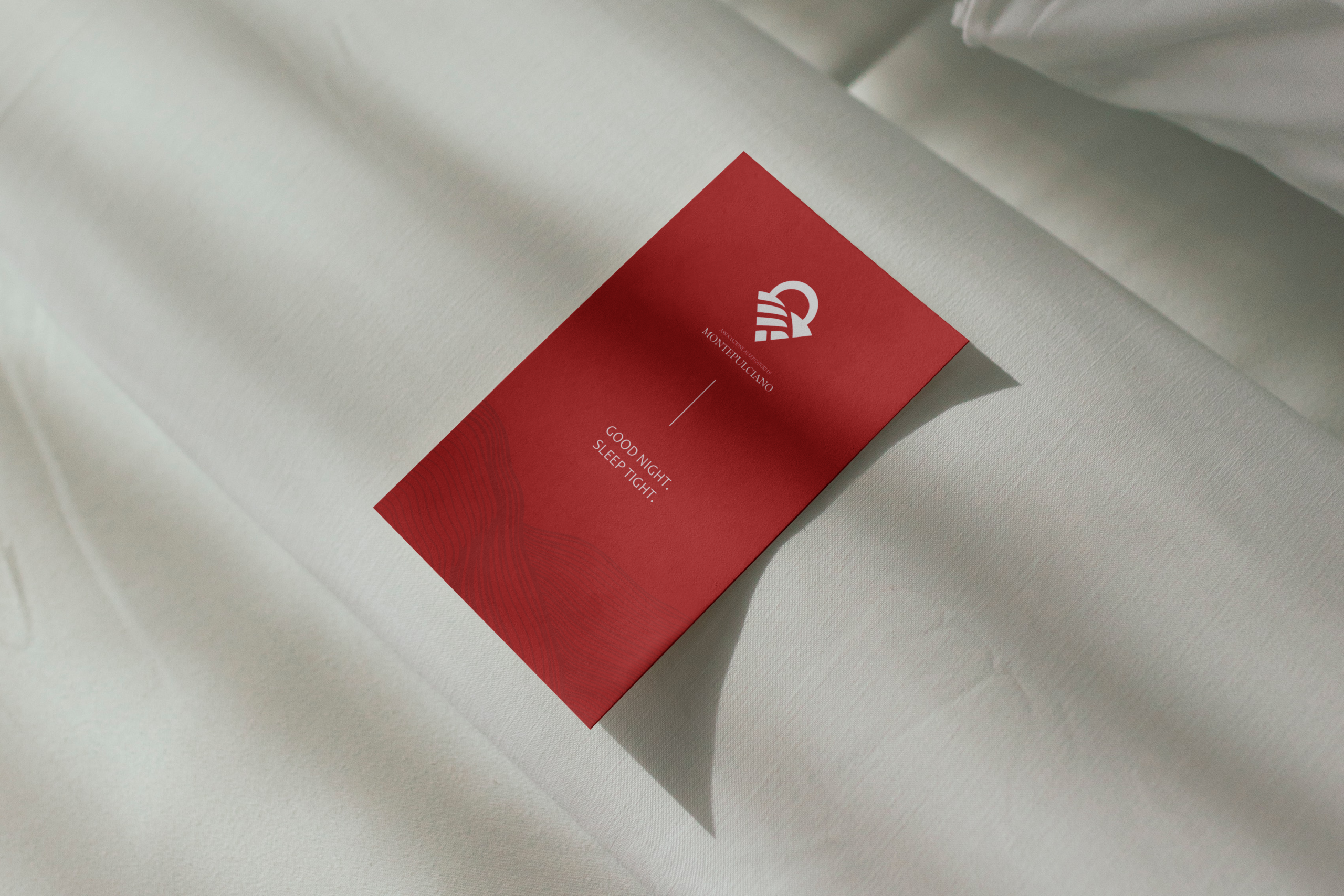
For this project I had to redesign the logo for an Italian hotel located in Montepuliciano. The logo had to be representive to the company and fitting with their aestethic. I had to use elements that the hotel and location was known for and use the colors they had in the original logo. I also had to present the logo used on different elements.
The design I went with is a representive and clean logo, giving a feeling of the sunset/sunrise in the italian fields. I also chose to include illustrated fields on the mpckups to make it feel even more Italian. For the color I went with their original red, but tried out black and white on the mockups.